Timeline
September 2022 - December 2022
Role
Designer
PROJECT OVERVIEW
Introduction
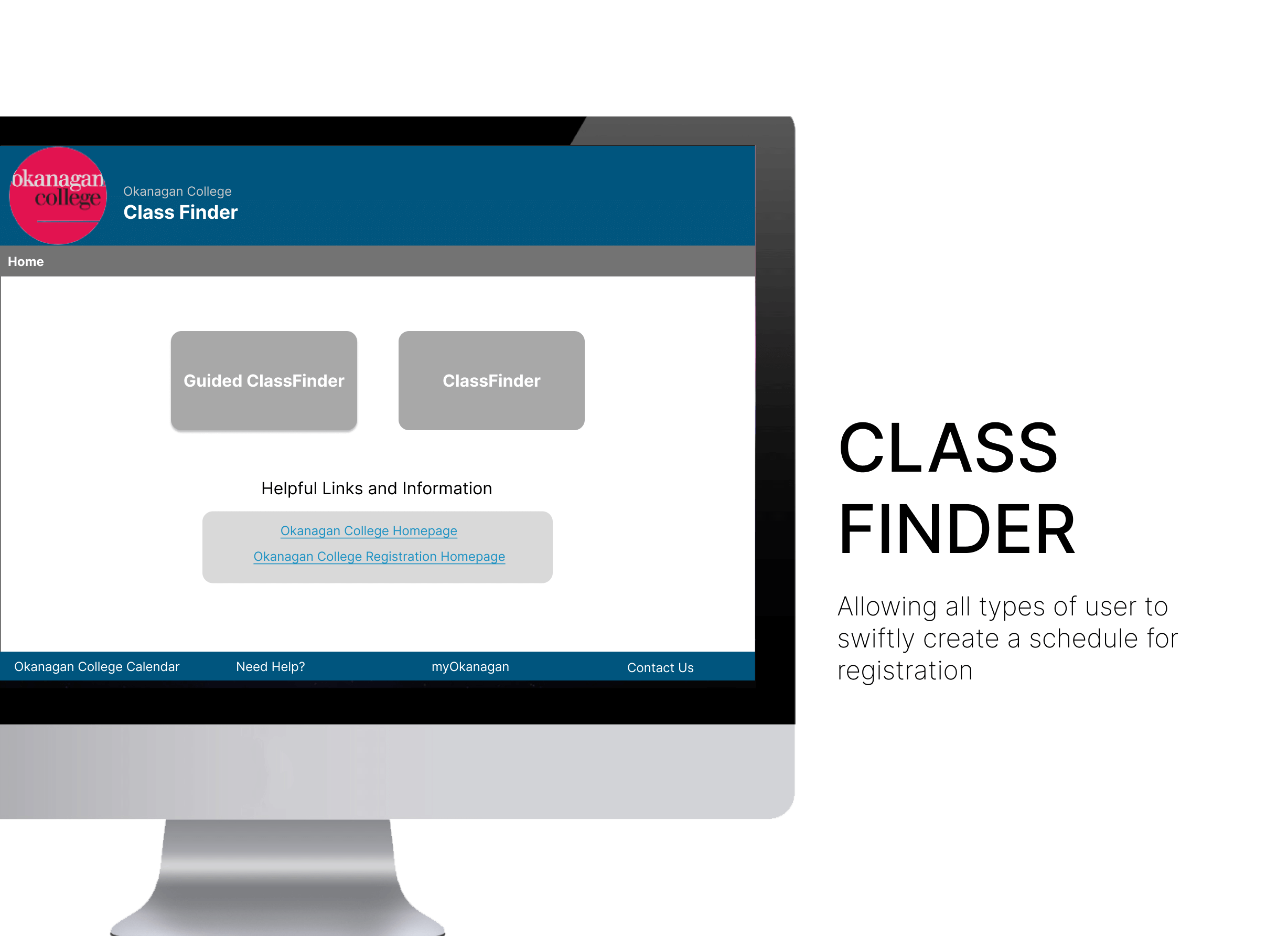
The ClassFinder prototype was created to as a re-design of the existing ClassFinder System at Okanagan College. The project had the contribution of 4 individuals during a period of 4 months as part of the 'COSC 341 User Experience' course offered at Okanagan College.
Problem Faced
Every semester students at Okanagan must create their schedule. After which they can use the made schedule to enter their schedule information in the registration system. Currently students take screenshots of their schedules then register. How can the system be accessible to novice users as well as long term users of the system?
The Ultimate Objective
The main ideal behind ClassFinder re-design is to make it easy for all sorts of users to easily get acquainted with the system.It will also help users get their schedule to either enter into the registration system or hand the schedule over to the registration office.
Users
User Personas
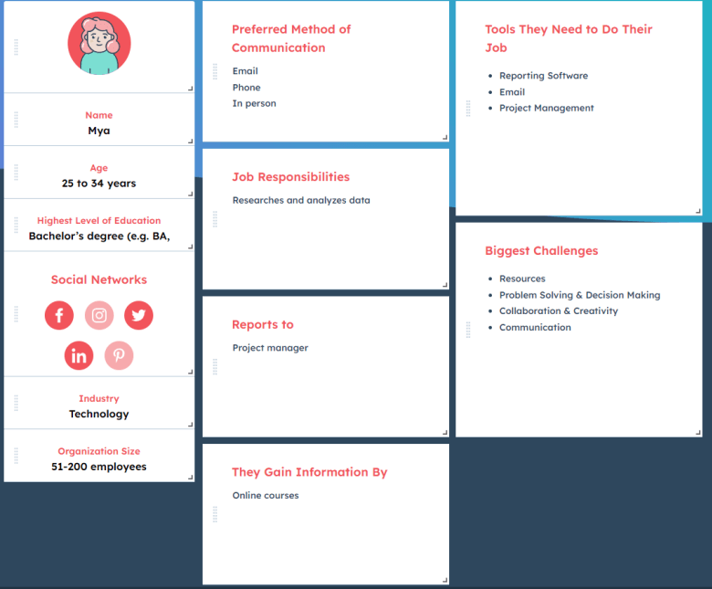
Mya the Persona
Mya is one of the personas that was looked at .Her criteria can be seen on the left
Types of Users
- Primary Users: Current Students
- Secondary Users: Registration Office
- Tertiary Users: Instructors
From Analysis to Implementation
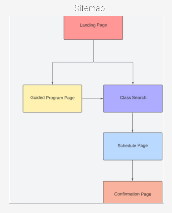
Site Map
The Sitemap indicates the layout of pages in the application
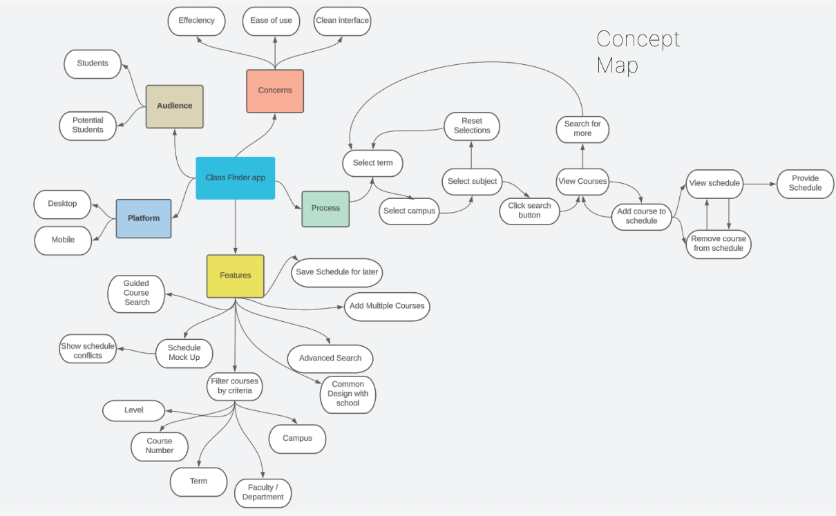
Concept Map
We applied various techniques for ideation. We creates a concept map as part of our brainstorming process to have a idea of what we wanted the new re-design of the system to incorporate. As part of that these are some conclusions of some things we wanted for the new re-design:
- Focus on a desktop platform
- Improvements on the existing Class Finder: Simple course search, Advanced ad-hoc class filtering
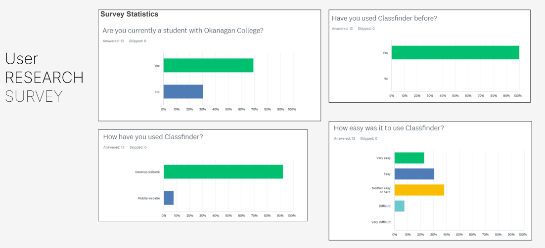
User Research
As part of the Requirements gathering phase we conducted a Survey to find out more about the users of the existing Class Finder application. One of the questions paused was.If you could change one thing about Classfinder, what would it be?.Below are some of the responses
- Ease of use
- Less confusing layout
- Allow searching by time/day of class
- Make conflicts more apparent
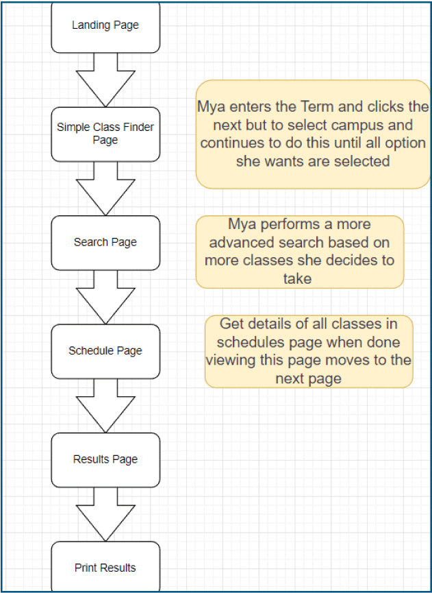
Task Analysis
We conducted a task analysis on the user personas to highlight the path they would take in navigating the website has can be see in the photo. Mya: Mya recently graduated from another institution with her bachelors degree and is returning to school as a new student at okanagan college ,belows is the journey she takes to create her schedule:
Sketches & Mockups
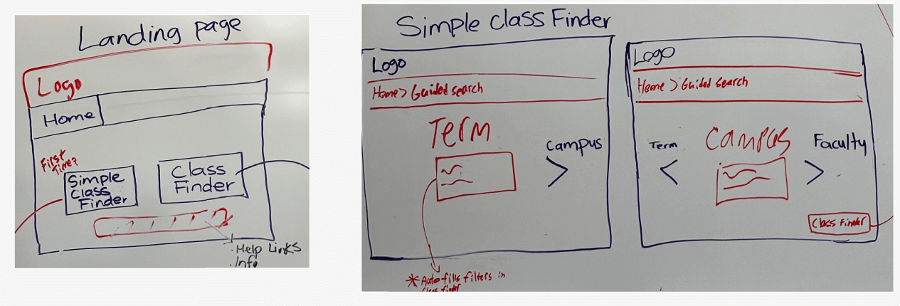
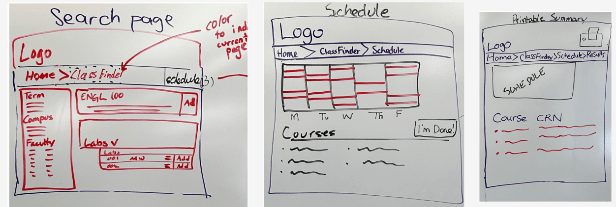
After having created a concept map .We created rapid sketches of some of the ideas during the designing alternatives phase.
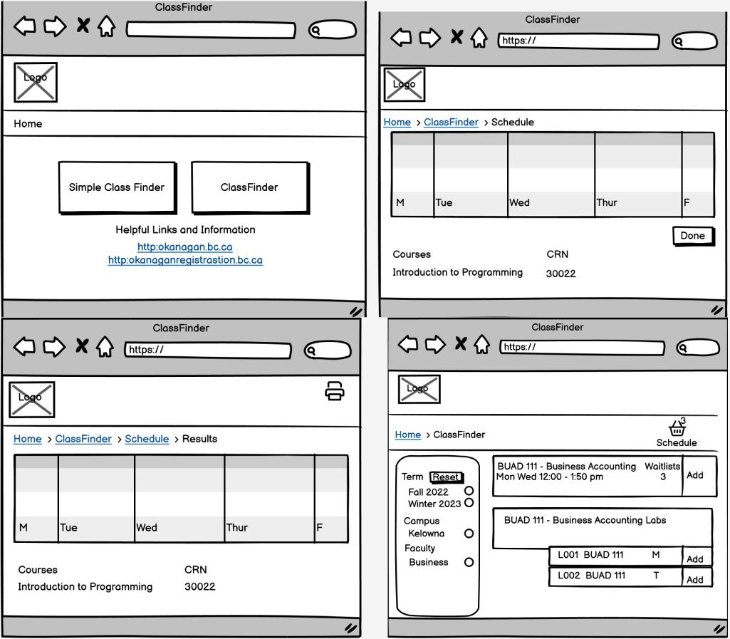
After creating the sketches we went straight into Balsamiq software to create some of the wireframes. These are the final versions of the wireframes for main pages for what an advanced user would use.
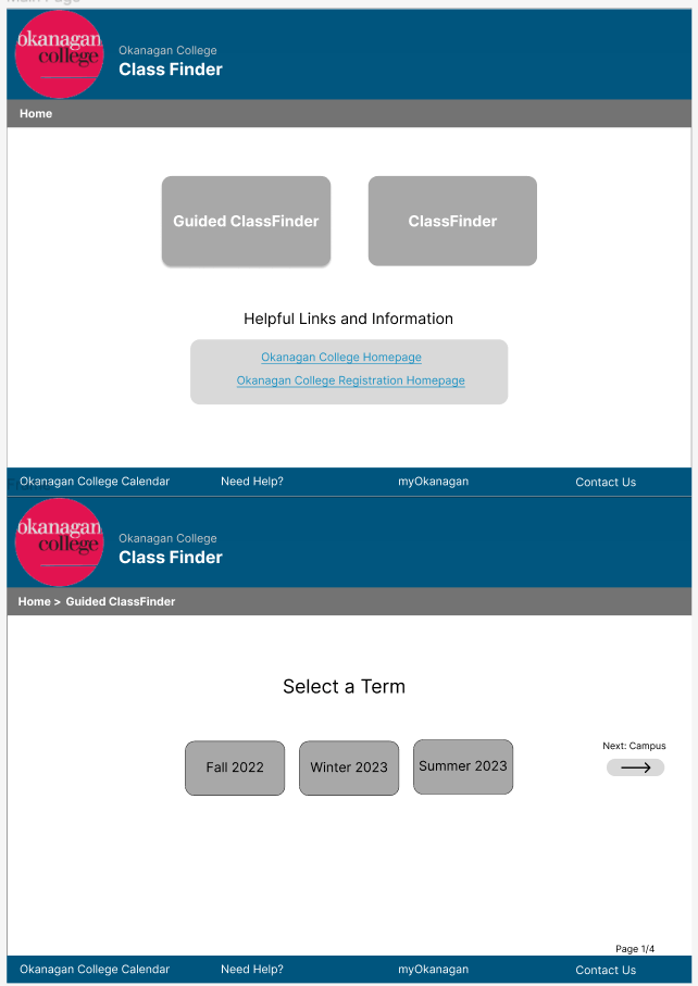
These are some of the High Fidelity prototypes that were done in Figma
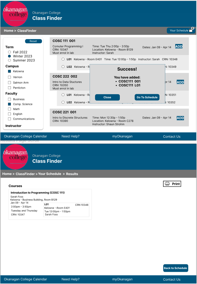
During the prototyping stage we first created medium fidelity mockups in Figma and we added interactivity to turn them to high fidelity prototypes. Some changes were made to the mockups , if any feedback came from the guerilla testing we performed.
Prototype
View Hi-Fi Figma Prototype Here.
Lessons Learned
What improvements can be made if the project where to continue?
- Use a standard aspect ratio such as 16x9
- Add mobile device scaling
- As a team we can utilize Figma more fully :
- Better organized assets
- Create more components
- Use component variants for interaction
What we learned as a team
We could have use better signifiers, as they make a big difference for the user
Working on the project in small steps is important rather than skipping steps it can produce better results for the design and users
Making accomodations for all types of users is important from novice to advanced users
SEE MORE OF MY CASE STUDIES
Flexible Work Location Tool